
Why did you have to take my 'joke' logo as your basis... :lol: (see filename)
Re: Logo Madness
« Reply #885, on January 23rd, 2012, 08:46 AM »
 Best font for the logo..?


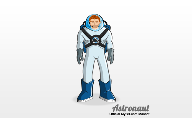
| 1. | Which is kind of important to me, especially in light of MyBB's new logo/mascot, which is an astronaut suit. |

As for Live's ideas, I like them stylistically though they need polish to get rid of the jaggies.
Why did you have to take my 'joke' logo as your basis... :lol: (see filename)
Pixel-perfect design is a bit of a challenge with not the stillest hands. It's around the "petals", right? I could apply a small white glow to hide it.
what's it supposed to mean? That they target the Man on the Moon? What about us Earthlings?
After numerous ideas, we finally decided on an astronaut, because we feel it best demonstrates the following attributes of our forum software: strength, power, friendliness and dominance.
Posted: January 24th, 2012, 02:35 AM
Re Mybb logo: this?
lol, what's it supposed to mean? That they target the Man on the Moon? What about us Earthlings?
📎 welogo32.png - 2.4 kB, 90x22, viewed 448 times.
📎 welogo32c.png - 2.2 kB, 55x54, viewed 429 times.


 <br /><br />cough, cough.