This section allows you to view all posts made by this member. Note that you can only see posts made in areas you currently have access to.
16
Other software / Re: So, I've been asked...
« on April 1st, 2011, 09:46 PM »
But the personal site uses certain software that can be seen as competition, and by you using it you give advertising to it.
JBlaze, when they asked you to remove the links to your IPB stuff, were you linking to the main IPB site or was it your personal site that used the product?
JBlaze, when they asked you to remove the links to your IPB stuff, were you linking to the main IPB site or was it your personal site that used the product?
17
Other software / Re: So, I've been asked...
« on April 1st, 2011, 09:25 PM »
I was just asked to do the same by Kindred, and I'm replying to him that Sinan has one to phpBB...
19
Off-topic / Re: Happy Birthday Nao!
« on March 21st, 2011, 04:51 AM »
Happy Birthday! I hope you have a great day!!
20
Off-topic / SQL injection to traffic cameras
« on February 20th, 2011, 03:23 PM »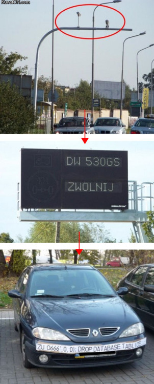
21
The Pub / Re: Logo Madness (Was: New revs)
« on November 24th, 2010, 07:05 PM »
Alright... alone in the dark then... that poor d... lol
I don't like so much the displacement of the slogan, but it's just me, it seems that the g now has a prominent spot, that's where my eyes were drawn first. From the two variations on this page I prefer the first one, but my ultimate favorite is your first one, with the slogan on top.
I don't like so much the displacement of the slogan, but it's just me, it seems that the g now has a prominent spot, that's where my eyes were drawn first. From the two variations on this page I prefer the first one, but my ultimate favorite is your first one, with the slogan on top.
22
The Pub / Re: Logo Madness (Was: New revs)
« on November 24th, 2010, 06:54 PM »The actual triangle-shaped symbol can be used as a extra illustrative item in other contexts perhaps.
I like it with the slogan on top, now the d seems naked :-/
23
The Pub / Re: Logo Madness (Was: New revs)
« on November 24th, 2010, 06:38 PM »
I agree with you, I just think you didn't understand me, here is what I was referring to, I like the longer d because of this.
24
The Pub / Re: Logo Madness (Was: New revs)
« on November 24th, 2010, 06:28 PM »
Yes, I like that too, but I think I would make the d longer, like the original, or just a tiny bit, or maybe not, you are the designer :) to me a longer d serves as the center and gives me the illusion of a triangle, just a hint.
25
The Pub / Re: Logo Madness (Was: New revs)
« on November 24th, 2010, 05:34 PM »
Of course! isn't it a beauty? has balance, I like how the "really" is after the "d" to reiterate, the spacing gives a pause... like, REALLY, get it, it's simple math!!

26
The Pub / Re: Logo Madness (Was: New revs)
« on November 24th, 2010, 05:02 PM »
Yes, I was referring exclusively to the blue one, the one for public areas. It has the slogan on top, rather than underneath, I think it makes it rounder, more compact.
Well, for the extruded logo, I guess I can live without that, it's a nice touch tough.
Well, for the extruded logo, I guess I can live without that, it's a nice touch tough.
27
The Pub / Re: Logo Madness (Was: New revs)
« on November 24th, 2010, 03:19 PM »
I meant the one that we are using in the frontpage, not the one we see here, and yes I meant the extruded logo, looks like a thin wedge to me :)
28
The Pub / Re: Logo Madness (Was: New revs)
« on November 24th, 2010, 02:41 PM »
I like Bloc's the best, it's tighter, the slogan gives balance to the overall logo, and I like the hint of a wedge between the W and the E, I would actually make it more pronounced, just a tiny bit.
29
The Pub / Re: Logo Madness (Was: New revs)
« on November 19th, 2010, 09:41 PM »
I like the one here, seems better with the small wedge, less intrusive.
30
The Pub / Re: Logo Madness (Was: New revs)
« on November 19th, 2010, 08:52 PM »
I have one... "Simply Powerful" :cool: